Build Powerful Finance Dashboards with Excel Templates
When you need a clear view of cash flow, profitability, or budgeting performance, a well‑crafted finance dashboard can be the difference between guesswork and confident decision‑making. Excel remains the go‑to platform for many finance teams because it’s flexible, familiar, and—when paired with the right template—able to deliver interactive visualizations without a pricey BI suite. Below we’ll explore how to set up finance dashboards in Excel, what to look for in a template, and a handful of practical tips to keep your reports both insightful and easy to maintain.
Why Finance Dashboards Matter for Decision‑Makers
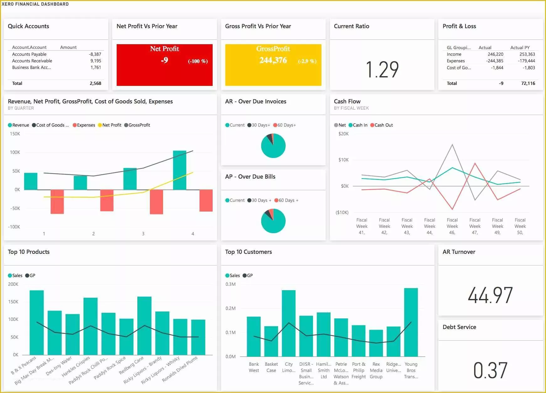
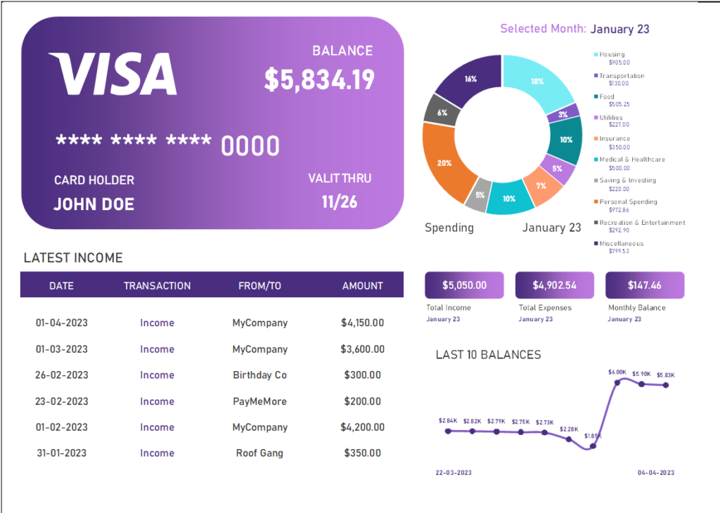
Finance professionals juggle numbers, forecasts, and variance analyses daily. A static spreadsheet full of raw data can quickly become overwhelming. Dashboards distill those rows and columns into key performance indicators (KPIs) that tell a story at a glance. Executives can spot trends, identify risks, and allocate resources faster when the data is presented visually—think sparklines, slicers, and conditional formatting that change color as thresholds are crossed.
Beyond speed, dashboards promote consistency. When everyone uses the same layout and formulas, the organization speaks one financial language. That uniformity reduces the chance of misinterpretation and makes it easier to compare performance across departments or time periods.
Core Elements Every Excel Finance Dashboard Should Contain
- Clear KPI tiles. Highlight the most critical numbers—revenue, net profit margin, cash conversion cycle—using large fonts and contrasting colors.
- Trend charts. Line or area graphs that show month‑over‑month or year‑over‑year movement give context to the KPI tiles.
- Break‑down tables. Drill‑down data, such as expense categories or regional sales, lets users explore the drivers behind headline figures.
- Interactive controls. Slicers, drop‑down lists, and timeline filters let viewers toggle between scenarios, fiscal years, or business units without touching the underlying data.
- Dynamic ranges. Using Excel tables or OFFSET formulas ensures charts automatically expand as new data is added.
When these pieces are combined thoughtfully, the dashboard feels like a living report rather than a static snapshot.
Selecting the Right Template—or Building One From Scratch
If you’re new to dashboard design, start with a pre‑made template. Many vendors offer free or low‑cost Excel finance dashboard templates that already include named ranges, chart formatting, and slicer connections. Look for templates that:
- Use structured tables (Ctrl + T) so new rows are incorporated automatically.
- Separate raw data, calculations, and presentation layers—this “three‑sheet” approach keeps the model tidy.
- Provide clear documentation, such as a “Read Me” sheet explaining where to update data.
However, a one‑size‑fits‑all template can feel restrictive. If your organization has unique reporting cycles or niche KPIs, consider building a custom dashboard. Begin with a clean data sheet, define the calculations you need (e.g., rolling 12‑month averages), and then map each KPI to a visual element. By designing the layout yourself, you control everything from color palette to the placement of interactive controls.
Practical Tips for an Effective Excel Finance Dashboard
1. Keep the Layout Simple and Consistent
White space isn’t wasted—it guides the eye. Align KPI tiles in a grid, use the same font size for similar headings, and reserve a single color for positive variance (often green) and another for negative (red). Consistency reduces cognitive load.
2. Leverage Named Ranges and Tables
Rather than hard‑coding cell references, name your data ranges. A formula like =SUM(SalesData[Amount]) reads much clearer than =SUM(B2:B152). It also makes troubleshooting easier when the dashboard evolves.
3. Use Conditional Formatting Sparingly
Highlighting a KPI that falls below target is useful, but too many rules can clutter the view. Apply formatting only to the most critical metrics, and choose subtle shades that don’t distract from the main chart.
4. Add Slicers for Quick Filtering
Slicers act like visual buttons—click a region, a product line, or a fiscal quarter, and every linked chart updates instantly. Pair slicers with a pivot table that feeds your charts, and you’ll give users a “self‑service” experience without a separate BI tool.
5. Protect the Model While Allowing Interaction
Lock calculation sheets and hide formulas, then unlock only the cells where users input new data or interact with slicers. This prevents accidental changes that could break the dashboard.
6. Test Performance with Real Data Volumes
Excel handles thousands of rows comfortably, but complex formulas can slow things down. Before rolling out, load a full year of transactions and see how quickly the dashboard refreshes. If performance lags, consider simplifying formulas or using Power Query to pre‑aggregate data.
Maintaining Your Dashboard Over Time
A dashboard isn’t a set‑and‑forget artifact. Schedule a quarterly review to verify that the underlying assumptions—like revenue recognition rules or cost allocation methods—still reflect reality. Update any visual branding changes, such as corporate colors, to keep the report looking polished.
Finally, document changes. A simple change‑log sheet that notes the date, what was altered, and who made the edit helps new team members understand the dashboard’s evolution and reduces the risk of duplicated effort.
Frequently Asked Questions
What’s the difference between a dashboard and a traditional financial report?
A traditional report lists numbers in tables, often spanning many pages. A dashboard condenses those numbers into visual summaries and interactive elements, enabling faster insight without scrolling through endless rows.
Can I connect an Excel dashboard to live data sources?
Yes. Using Power Query, you can pull data from databases, cloud services, or CSV files that refresh with a single click (or on a schedule). This keeps the dashboard current without manual copy‑pasting.
How many KPIs should I display on one dashboard?
Quality beats quantity. Most finance leaders recommend focusing on 5‑7 top‑level KPIs; additional detail can be accessed via drill‑down tables or separate tabs.
Is it safe to share an Excel dashboard with external partners?
Protect sensitive data by removing or masking confidential cells before sharing. You can also save the file as a PDF for static viewing, or use Excel’s “Read‑Only” mode with a password to limit edits.