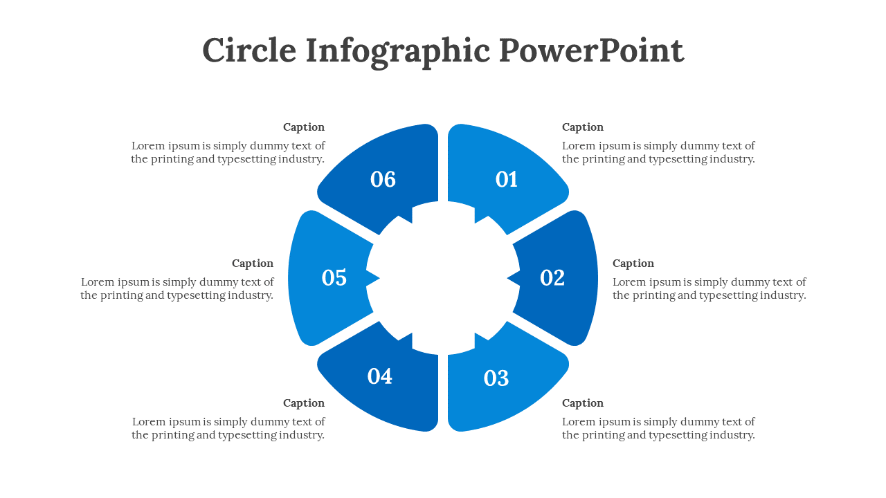
Create Eye‑Catching Circular Infographics in PowerPoint
Why the Circle Still Rules Visual Storytelling
There’s something inherently soothing about a round shape; it draws the eye inward and suggests completeness. In a sea of rectangular slides, a circular infographic acts like a visual oasis, breaking monotony without shouting for attention. That subtle balance of novelty and familiarity is why designers keep reaching for doughnut charts, radial diagrams, and orbit‑style layouts.
Getting Started: The Basics of a Circular Template
Before you hunt for a pre‑made template, check three fundamentals. First, decide what data you need to convey—percentages, process steps, or hierarchical relationships? Second, map those points onto a circle: central hub, rings, or spokes, whichever feels natural. Third, choose a color palette that preserves contrast without overwhelming the viewer.
Most PowerPoint users start with a blank slide, but the real time‑saver is the “SmartArt” gallery. Under the “Relationship” category you’ll find a handful of radial graphics that can be reshaped into perfect circles with a few clicks. From there, you can replace placeholder icons, tweak segment sizes, and lock the layout so future edits stay clean.
Top 5 Places to Find Ready‑Made Circular Templates
- Microsoft’s own template library. A quick search for “circular infographic” pulls up a dozen free designs that already respect PowerPoint’s grid system.
- Envato Elements. For a subscription, you get thousands of high‑resolution circular layouts, many with animated entry effects.
- SlideModel. Their “Radial Process” packs come with editable charts, icons, and even pre‑colored schemes.
- GraphicRiver. If you prefer one‑off purchases, you can download a single .pptx file and avoid a monthly fee.
- Canva’s PowerPoint export. Create a circle‑centric design in Canva, then export it directly as a PowerPoint file to keep layers intact.
Customizing a Template Without Breaking Its Structure
Once you’ve settled on a base, the temptation is to add every flashy element you can find. Resist that urge. A well‑balanced circular infographic thrives on hierarchy; too many layers blur the focal point. Start by editing the central content—often the key metric or headline—because it anchors the viewer’s gaze.
Next, adjust the outer rings. If you’re showing quarterly growth, each slice could represent a quarter, with the size reflecting performance. Use subtle gradients rather than bold fills; the gradient guides the eye around the circle instead of pinning it to a single spot.
Finally, consider iconography. Simple line icons work better than detailed illustrations, especially when the circle is already dense with data. Keep the line weight consistent across all icons; mismatched styles can make the slide feel haphazard.
Animating Circular Infographics for Maximum Impact
Animation can turn a static circle into a storytelling device, but only if it’s purposeful. A common technique is “wipe” animation that follows the circumference, revealing each segment in sequence. Pair this with a brief pause so the audience can absorb the information before the next piece appears.
Another subtle move is to apply a “pulse” effect to the central hub when you introduce the main takeaway. The pulse should be barely noticeable—just enough to draw the eye without sounding like a fireworks display.
Remember to test the slide in “presenter view.” Sometimes an animation that looks smooth in edit mode stutters on older hardware, breaking the flow of your narrative.
Design Tips That Keep Your Circle Looking Professional
- Maintain consistent spacing. Use PowerPoint’s alignment guides to ensure each segment has equal gaps.
- Limit the number of colors. Stick to three primary hues plus a neutral for background.
- Choose legible fonts. Sans‑serif fonts in 18‑24 pt work well for labels that wrap around the curve.
- Use contrasting text. Light text on dark slices, and vice versa, prevents readability issues.
- Export as a high‑resolution image. If you need to embed the slide elsewhere, PNG at 300 dpi preserves crisp edges.
Common Pitfalls and How to Avoid Them
One frequent mistake is over‑segmenting the circle. Too many slices turn the infographic into a pie chart, losing the unique flair of a radial layout. If you have more than eight data points, consider grouping them into broader categories or using a secondary ring.
Another trap is ignoring the slide’s overall balance. A circular graphic that dominates one side of the slide creates visual tension. Offset the circle slightly and place complementary text or icons on the opposite side to restore equilibrium.
Finally, don’t forget accessibility. Color‑blind viewers may miss distinctions between similarly hued segments. Add texture overlays or dual‑tone labels to ensure everyone can interpret the data.
Putting It All Together: A Quick Walkthrough
Imagine you need to present a company’s sustainability milestones. Start with a central icon of a leaf and a bold “2024 Goal: Net‑Zero.” Around it, place three concentric rings: the innermost shows carbon reduction percentages, the middle outlines renewable energy sources, and the outermost lists community initiatives. Apply a muted green palette, a single sans‑serif font, and a gentle wipe animation that circles clockwise. When you’re done, preview the slide in full‑screen mode to confirm the rhythm feels natural.
The result is a visually appealing, easy‑to‑follow story that fits on a single slide—exactly what busy executives appreciate.
Where to Find Inspiration Outside PowerPoint
If you want to push the envelope, browse design platforms like Dribbble or Behance for circular infographics that aren’t constrained by PowerPoint’s default shapes. Notice how they play with negative space, incorporate hand‑drawn elements, or blend photography into the rings. You can then import those ideas back into PowerPoint as PNG overlays, mixing custom artistry with the program’s reliability.
Even a quick Google Image search for “radial data visualization” can spark a new approach—perhaps a circular timeline or a sunburst diagram that better matches your dataset.