How to Build an Effective Legal and Policy Analysis Dashboard
In today’s fast‑moving regulatory environment, teams need more than a spreadsheet to keep track of statutes, case law, and internal policies. A well‑designed dashboard turns raw data into actionable insight, letting lawyers, compliance officers, and decision‑makers spot trends at a glance. Below we walk through the essential pieces, from picking the right metrics to visualizing the results without drowning the user in jargon.
Why a Dashboard Matters for Legal & Policy Work
Legal departments are no longer siloed archives; they’re strategic hubs that influence risk management and business direction. A dashboard bridges the gap between legal research and executive oversight by:
- Consolidating disparate data sources—court opinions, regulatory filings, internal policy updates—into a single view.
- Highlighting compliance gaps before they become costly violations.
- Enabling real‑time monitoring of legislative activity that could impact the organization.
In short, it transforms information overload into a clear, concise story.
Core Components to Include
Key Metrics (KPIs)
Choosing the right indicators is half the battle. Consider metrics that reflect both risk exposure and operational efficiency, such as:
- Regulatory change frequency – how often relevant statutes are amended.
- Pending litigation count – cases that could affect financial reporting.
- Policy compliance rate – percentage of business units adhering to internal standards.
- Average response time – days taken to address a legal request.
Data Visualization
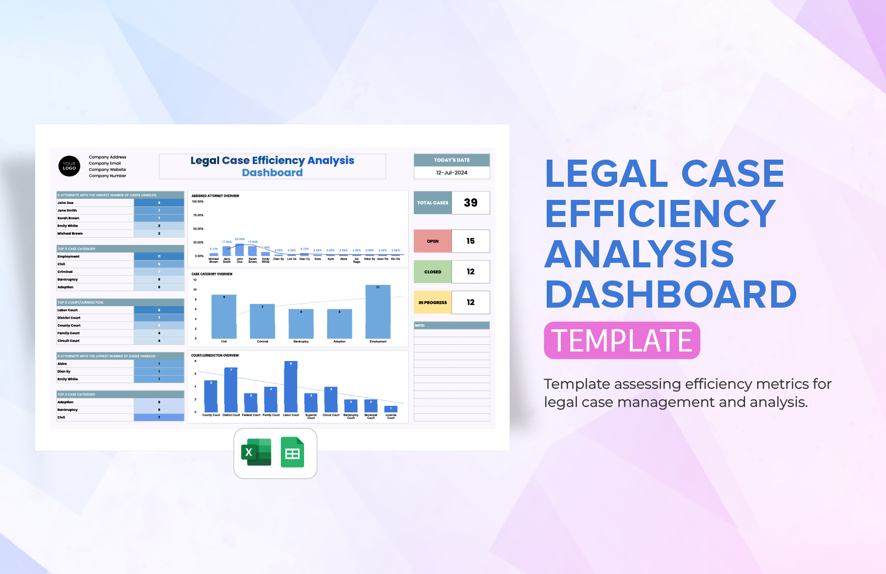
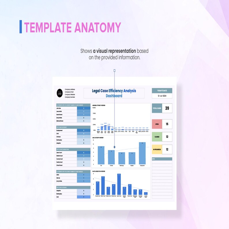
Charts should do the heavy lifting. Trend lines are perfect for showing how a regulation evolves over months, while heat maps reveal which departments are lagging on policy adoption. Keep colors purposeful: reds for high risk, greens for compliance, and neutrals for neutral data.
Drill‑Down Capability
High‑level executives need the big picture, but analysts often require the details behind a spike. Implement clickable elements that reveal underlying documents, case numbers, or policy clauses without leaving the dashboard.
Selecting Reliable Data Sources
Legal data isn’t housed in a single repository. Typical feeds include:
- Public legal databases (e.g., Westlaw, LexisNexis) for case law.
- Government APIs that publish new regulations and statutes.
- Internal document management systems for policy manuals and SOPs.
- Ticketing platforms tracking legal requests and their status.
Before pulling data, verify licensing agreements and ensure that any personal or confidential information is anonymized in accordance with privacy laws.
Design Practices That Keep Users Engaged
Even the smartest metrics fall flat if the layout is confusing. Follow these guidelines:
- Prioritize hierarchy. Place the most critical KPI at the top left; the eye naturally wanders there first.
- Limit clutter. One chart per row keeps the interface breathable.
- Use consistent terminology. A “policy breach” should never be called a “non‑compliance incident” elsewhere on the same screen.
- Responsive design. Stakeholders may check the dashboard on a laptop, tablet, or smartphone.
Step‑by‑Step Implementation
- Define objectives. Gather input from legal counsel, compliance heads, and senior leadership to pinpoint what success looks like.
- Map data flows. Diagram where each data point originates, how it’s transformed, and where it lands on the dashboard.
- Choose a platform. Options range from dedicated BI tools like Power BI or Tableau to custom-built web apps.
- Build prototypes. Draft wireframes, test them with a small user group, and iterate based on feedback.
- Automate data ingestion. Set up scheduled pulls or webhooks to keep the dashboard fresh without manual effort.
- Launch and train. Conduct brief walkthroughs that focus on interpreting the visual cues rather than technical details.
- Monitor and refine. Track usage metrics—click‑through rates, time spent—and adjust visualizations that aren’t resonating.
Common Pitfalls and How to Avoid Them
Even seasoned teams stumble over a few recurring issues:
- Over‑loading with metrics. Stick to a dozen high‑impact KPIs; more than that dilutes focus.
- Neglecting data quality. Inaccurate source feeds generate misleading charts. Implement validation rules.
- Failing to align with business goals. If senior leadership can’t see the connection to risk reduction or cost savings, the dashboard will be ignored.
- Static reporting. Legal landscapes change quickly. Schedule refresh cycles—daily for regulatory feeds, weekly for internal policy audits.
Real‑World Benefits You’ll Notice
When a legal and policy analysis dashboard works as intended, the ripple effects are tangible:
- Reduced time spent searching for relevant statutes—what used to be hours becomes minutes.
- Proactive risk mitigation, with early alerts preventing non‑compliance fines.
- Improved cross‑departmental communication, as everyone references a shared visual language.
- Data‑driven decision making, allowing executives to allocate resources to the most vulnerable areas.
Ultimately, the dashboard becomes a living document, reflecting the organization’s legal health in real time.