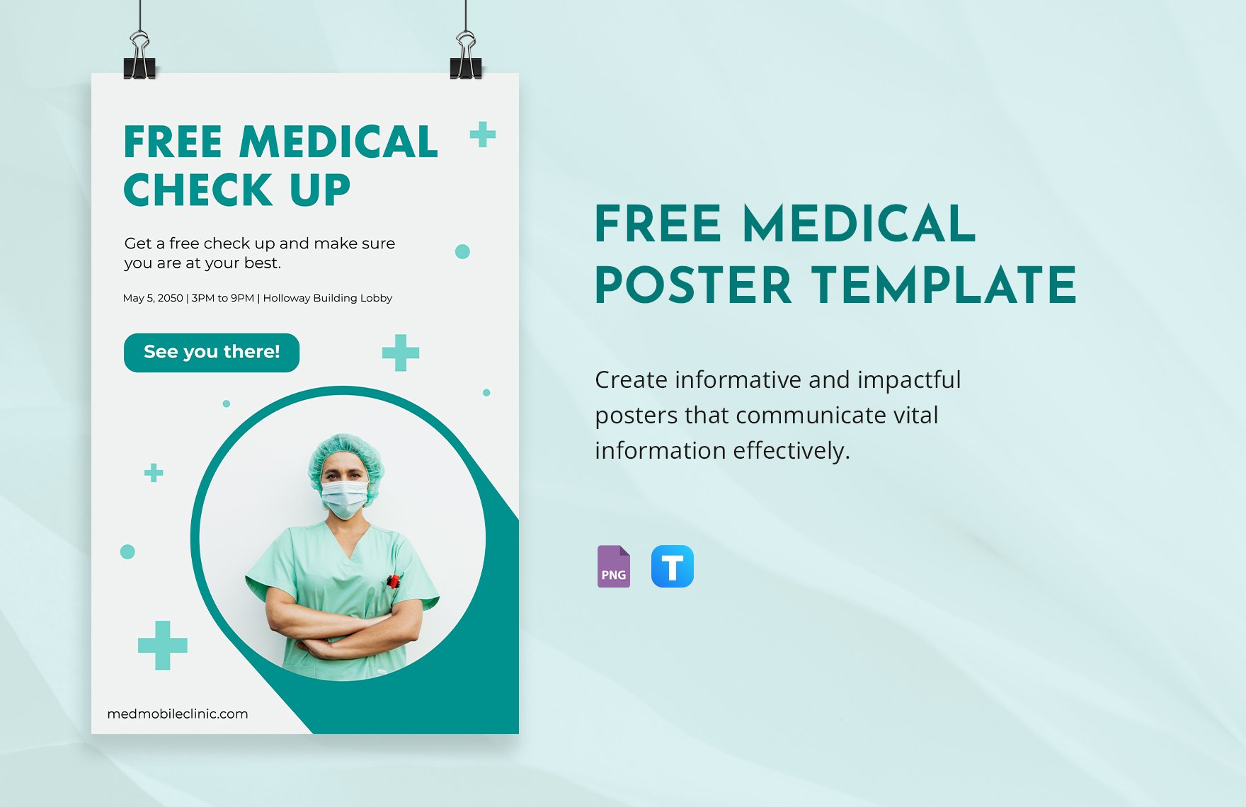
How to Design an Effective Medical Conference Poster Template
When you walk into a bustling medical conference, dozens of posters vie for attention. A well‑crafted poster can turn a fleeting glance into a meaningful conversation, but only if the design guides the reader’s eye without overwhelming them. Below is a practical walk‑through of the choices that matter most, from layout fundamentals to the tiniest typographic tweaks.
Start With a Clear Structure
Think of your poster as a story on a single sheet. Most attendees scan from top left to bottom right, so arrange your sections in that natural flow:
- Title & Authors – bold, legible from a distance.
- Introduction – a concise hook, no more than three sentences.
- Methods – visualized with flowcharts or simple icons.
- Results – the centerpiece; use graphs that speak louder than words.
- Conclusion & Implications – a punchy takeaway.
- References & Acknowledgments – small, yet readable.
Resist the urge to cram everything into one column; two or three columns work best for a 36" × 48" format, giving each element breathing room.
Choose Fonts That Work Under Light
Readability isn’t just about size; font families matter too. Sans‑serif fonts such as Helvetica or Arial stay crisp under the fluorescent lights common in conference halls. Pair a bold, 80‑pt title with a 24‑pt body font; subheadings can linger around 32‑pt. Avoid decorative typefaces—they’re eye‑catching at a cost.
Color: Grab Attention, Not Distract
Colors convey hierarchy:
- Background – a light, neutral shade (off‑white or pale gray) lets data pop.
- Accent – one or two bold hues (deep blue, teal, or muted red) to highlight key points.
- Text – high contrast, typically black or dark gray.
Run a quick check: step back 3‑4 feet. Does the title still stand out? If not, boost its contrast or enlarge it slightly.
Graphics That Communicate
Data visualizations are the heart of a medical poster. Follow these shortcuts:
- Simplify axes – remove gridlines that aren’t essential.
- Consistent palettes – use the same colors across related charts.
- Label directly – place data labels on bars or lines instead of relying on a legend.
High‑resolution images (300 dpi minimum) prevent pixelation when printed large. If you include a photograph of a specimen, crop tightly to keep the focus on the relevant feature.
Whitespace Is Your Ally
Empty space isn’t wasted; it’s a visual pause that lets the audience digest each segment. A good rule of thumb: leave at least 0.5 inch margin all around, and insert a blank line between sections. Overcrowding a poster is the fastest way to lose interest.
Practical Tips for the Final Layout
1. Set Up a Grid
Most design software (Adobe InDesign, PowerPoint, or even Canva) lets you define guides. Divide the canvas into equal columns and rows; align text boxes, images, and icons to these guides for a tidy appearance.
2. Test Readability at a Distance
Print a small draft (A4 size) and view it from a few feet away. If you can’t read the body text comfortably, increase the font size or reduce the amount of copy.
3. Use QR Codes Sparingly
A QR code can link to supplemental material, but make sure it’s at least 1 inch square and placed where it won’t clash with other elements. A short caption (“Scan for full data set”) clarifies its purpose.
Common Pitfalls and How to Avoid Them
- Too Much Text – Aim for bullet points; each line should convey a single idea.
- Inconsistent Fonts – Stick to two families maximum.
- Clashing Colors – Use a color‑blind friendly palette; tools like Coblis can simulate how your design appears.
- Missing Attribution – Forgetting to credit a data source can undermine credibility.
Final Checklist Before You Print
- Title readable from 4 feet?
- All images ≥300 dpi?
- Consistent font sizes and styles?
- Colors contrast check passed?
- Spelling and author affiliations double‑checked?
- PDF saved with CMYK color mode for print?
Cross each item off, and you’ll walk into the conference with a poster that not only looks professional but also invites conversation. After all, the best designs are the ones that let your research speak for itself.