How to Quickly Add Icons in Figma: A Step‑by‑Step Guide
If you're looking for easy steps to add icons in Figma, you’ve come to the right place. Icons are the tiny visual shortcuts that help users navigate, understand, and enjoy a product. Yet many newcomers stumble over the simple act of bringing an icon into a design file. In this guide we’ll walk through the process from start to finish, sprinkle in a few best‑practice tips, and point out the hiccups that often trip people up.
Why Icons Matter in Your Designs
Before we dive into the mechanics, it helps to remember why icons deserve a dedicated workflow. First, they communicate function at a glance—think of a trash‑can for delete or a magnifying glass for search. Second, a consistent icon set reinforces brand identity and lends a polished feel. Finally, well‑chosen icons can reduce the need for explanatory copy, keeping interfaces clean and fast to read.
Easy Steps to Add Icons in Figma
Figma’s flexible canvas makes importing and managing icons straightforward. Follow these five steps, and you’ll have a reusable icon ready for any frame.
1. Choose the Right Source
Start by locating a reliable icon library. Free resources like Feather, Material Icons, or Heroicons are popular because they’re vector‑based and open‑source. If your brand uses a custom set, make sure the files are saved as SVGs for optimal scalability.
2. Drag or Import the SVG
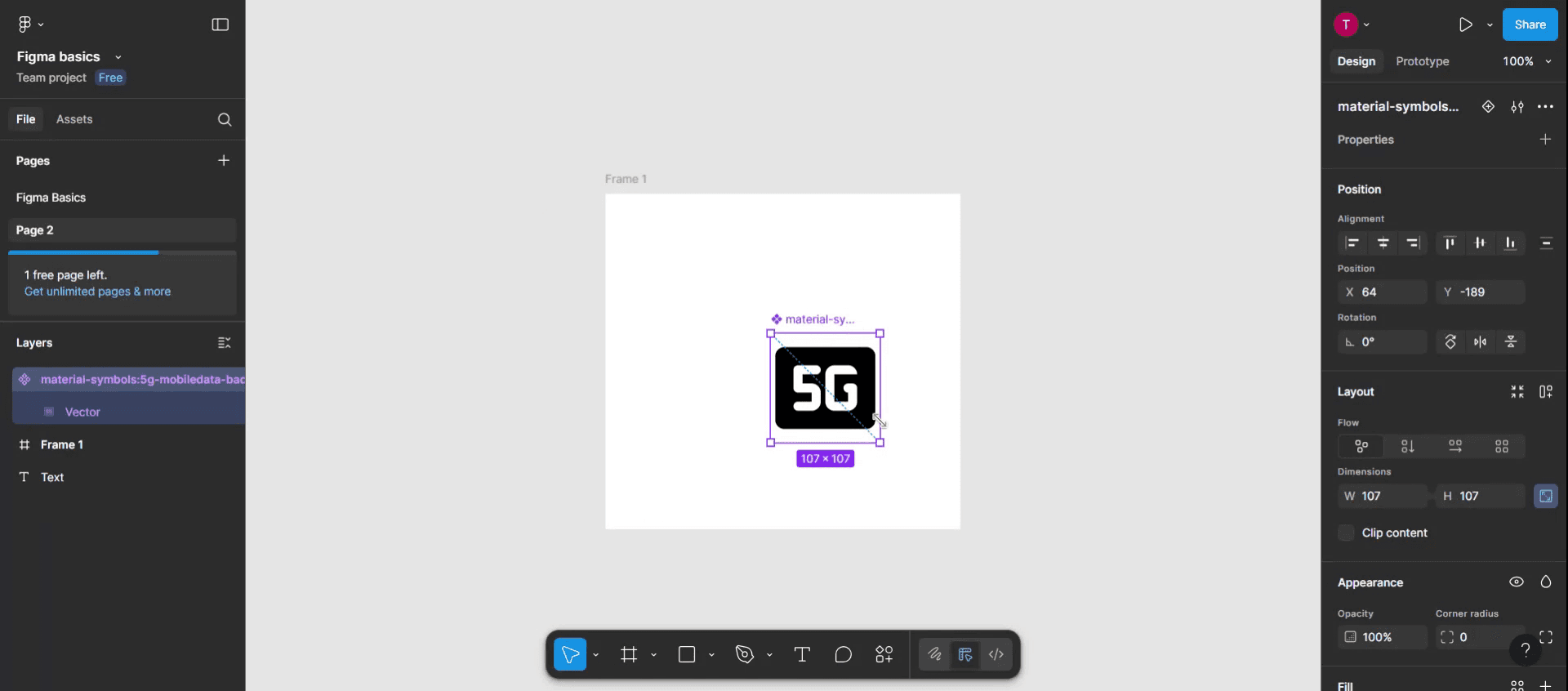
Simply drag the SVG file from your desktop onto the Figma canvas, or use File → Place Image… (⌘ Shift K on macOS). Figma automatically converts the SVG into vector layers, which you can edit without losing crispness.
3. Clean Up Unnecessary Layers
Many icon SVGs come with hidden groups or extra paths that aren’t needed. Open the Layers panel, expand the imported icon, and delete any stray groups or invisible rectangles. This keeps the component lightweight and easier to style later.
4. Create a Component
Select the cleaned‑up icon, then press Ctrl + Alt + K (or right‑click and choose Create Component). Naming conventions matter: use a clear label like Icon/Heart so you can find it quickly in the assets panel.
5. Add to an Icon Library (Optional)
If you work on multiple files, consider publishing the component to a team library. Open the Assets tab, click the Publish button, and enable the icon set for your collaborators. Now anyone on the team can drag the icon straight from the assets panel into their own frames.
Tips for Managing Icon Libraries
- Use Variants. Combine filled, outline, and disabled versions of an icon into a single component with variants. This reduces clutter and makes swapping states effortless.
- Leverage Auto‑Layout. Wrap icons in an auto‑layout frame with consistent padding. When you replace one icon with another, the spacing stays uniform across the UI.
- Adopt a Naming Scheme. A hierarchical name like
Icon/Navigation/BackorIcon/Social/Twitterspeeds up search and prevents duplicate components. - Sync Colors with Styles. Rather than hard‑coding a fill, link the icon’s color to a color style (e.g.,
Primary/Blue). Changing the style updates every instance instantly.
Common Pitfalls and How to Avoid Them
Even with a clear workflow, a few snags can appear. One frequent mistake is treating icons as raster images; that locks you into a single resolution and defeats the purpose of vector design. Another issue is neglecting accessibility—always add descriptive aria‑label text when exporting to code, and consider contrast ratios for filled icons. Finally, beware of “icon drift”: over time, different designers might start using slightly varied versions of the same symbol. Regularly audit your library and consolidate duplicates to keep the visual language tight.
Frequently Asked Questions
Can I edit the color of an imported SVG directly?
Yes. Once the SVG is on the canvas, select it and adjust the fill in the right‑hand properties panel. For more control, detach the component and edit individual vector paths.
Do I need a paid Figma plan to use shared libraries?
Shared libraries are available on the Professional tier and above. However, you can still create and reuse components within a single file on the free plan, which works well for solo projects.
What’s the best way to keep icons consistent across a large project?
Adopt a master library that contains all approved icons, enforce a naming convention, and use variants for different states. Encourage teammates to pull icons from the library rather than uploading new files.
Is it okay to use multiple icon sets together?
Mixing styles can look messy unless you deliberately blend them for a specific effect. In most cases, stick to one cohesive set or customize icons to share the same stroke weight, corner radius, and visual language.