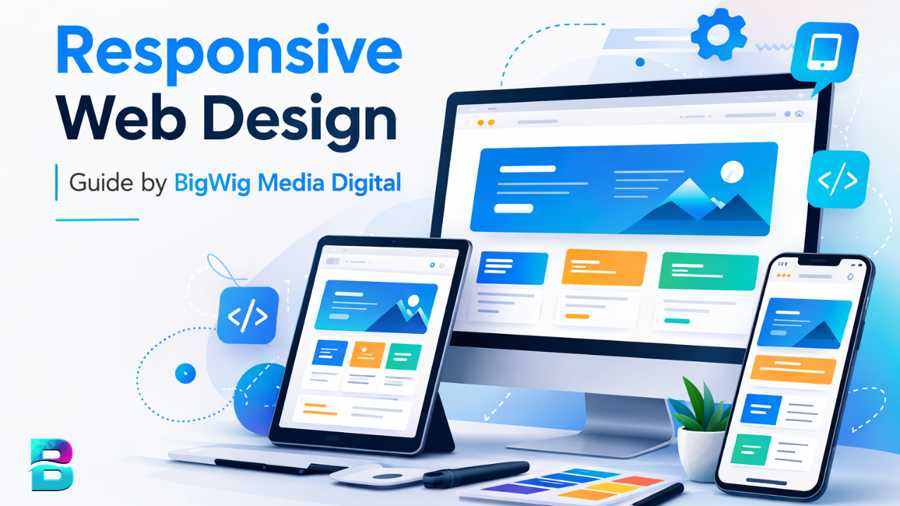
Mastering Responsive Web Design: An Easy Guide
Remember when "mobile-friendly" was just a nice-to-have feature? Those days are long gone. Today, if your website doesn’t look flawless on a smartphone, a tablet, and a 4K monitor, you are essentially telling half your audience to leave. But here is the good news: you don’t need to be a coding wizard to pull it off.
Creating a responsive web design less complicated than it sounds. It’s not about building three separate websites for three different devices. Instead, it’s about building one flexible structure that adapts to the screen it’s viewed on. If you’ve ever felt overwhelmed by the idea of media queries and fluid grids, take a breath. We are going to break this down into simple, actionable steps that make sense.
Let’s dive into how you can start creating a responsive web design today, without tearing your hair out.
Why Rigidity Is the Enemy
The biggest mistake early web designers made was thinking in pixels. They would set a container to exactly 960 pixels wide. On a desktop, that looked great. On a phone, it looked like a microscopic version of the site that required constant zooming. Responsive design flips this model on its head. It demands flexibility.
Think of it like water. Water doesn’t have a fixed shape; it takes the shape of its container. Your website should do the same. Instead of fixed units, you start thinking in relative units. This shift in mindset is the foundation of everything else that follows. It allows your content to breathe, expand, or contract based on the available space.
The Holy Trinity: Fluid Grids, Media Queries, and Flexible Media
While there are many tools in the modern developer’s belt, three core concepts carry the weight of responsive design. Mastering these will get you 90% of the way there.
1. Fluid Grids Using Percentages
Start by letting go of pixel-perfect rigidness. When defining the width of your columns or containers, use percentages. If you want a container to take up half the screen, set its width to 50%. If you want a three-column layout, each column takes up roughly 33.33%. This ensures that as the browser window expands or shrinks, your layout scales proportionally. It keeps the balance intact regardless of the device.
2. Media Queries for Breakpoints
Fluid grids are great, but sometimes you need to make drastic changes. You don’t want three columns of text on a narrow phone screen; that’s unreadable. This is where media queries come in. They are simple CSS rules that say, "If the screen is smaller than X pixels, do Y."
Don’t design for specific devices. Don’t worry about the exact width of an iPhone 14 or a Pixel 8. Instead, pick logical breakpoints. Common ones are around 768px (tablets) and 1024px or 1200px (desktops). At these points, you might stack your columns vertically, adjust font sizes, or hide non-essential elements. It’s about enhancing the user experience at those specific sizes.
3. Flexible Images and Media
Nothing breaks a responsive layout faster than a giant hero image that refuses to shrink. If you set an image to a fixed width of 1000px, it will overflow its container on a mobile screen, causing horizontal scrolling. The fix is surprisingly simple. In your CSS, add this rule to your images:
- Max-width: 100%;
- Height: auto;
This tells the browser: "Make sure this image never exceeds its parent container’s width, but adjust the height automatically to keep the aspect ratio." Boom. Your images are now fluid. For more advanced cases, you can use the <picture> element or the srcset attribute to serve smaller file sizes to mobile devices, which also helps with page load speed.
The Mobile-First Approach
Here is a pro tip that might seem counterintuitive if you are used to designing on a big monitor. Start your design process with the mobile version first. Why? Because you start with constraints. You have limited space on a phone, which forces you to prioritize content. What is truly essential?
When you design for mobile first, you build the core functionality and content hierarchy from the ground up. As you move to larger screens via media queries, you are adding complexity and space. This results in a cleaner, more focused website. If you design for desktop first, you often end up cramming desktop clutter into a tiny mobile viewport, which leads to a poor user experience.
Testing: See What Your Users See
You can guess your breakpoints, but you really need to test them. Firefox DevTools and Chrome DevTools have excellent responsive design mode built right in. They allow you to toggle between common device widths and simulate touch interactions.
However, emulators are not perfect. Always test on real hardware when possible. Touch targets on a real phone behave differently than clicks at a mouse. Fonts might render slightly differently on iOS versus Android. Checking your work on actual devices is the only way to catch those subtle quirks that break immersion.
Common Pitfalls to Avoid
Even experienced designers slip up. Here are a few common traps:
- Hidden Content: Don’t just hide desktop elements on mobile using
display: none. If the content is important, find a way to include it or replace it with a mobile-friendly alternative. - Tiny Tap Targets: Links and buttons on mobile need to be big enough for a thumb. Aim for at least 44x44 pixels for interactive elements.
- Ignoring Load Times: Responsive design isn’t just about layout; it’s about performance. Serving high-res images to mobile users kills performance. Optimize your assets.
Creating a responsive web design is an ongoing process. Screens change, standards evolve, but the core principle remains: put the user’s context first. By embracing fluidity and testing rigorously, you ensure that your website invites everyone in, regardless of how they choose to access it.
Frequently Asked Questions
Is responsive design the same as adaptive design?
No. Responsive design uses fluid grids to adapt continuously to any screen size. Adaptive design creates several fixed layout sizes for specific screen widths. Responsive is generally preferred today because it handles the infinite variety of new devices more gracefully.
What are the most common breakpoints?
While you should test your own layout, common breakpoints are: 320px-480px for mobile phones, 768px-1024px for tablets, and 1200px+ for desktops. Remember, these are guidelines, not laws. Design for your content, not just the numbers.
Does responsive design affect SEO?
Yes, significantly. Google uses mobile-first indexing, meaning it primarily uses the mobile version of the content for indexing and ranking. A non-responsive site may rank lower because it provides a poor experience for the majority of users.
Can I use a CMS?
Absolutely. Most modern CMS platforms like WordPress, Shopify, and Squarespace offer responsive themes out of the box. However, understanding the basics helps you customize these themes effectively rather than relying blindly on defaults.