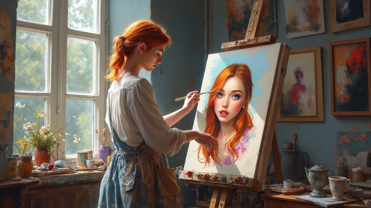
Mastering the Dark Background in Portrait Painting
There is something inherently theatrical about a subject emerging from the void. When you strip away the scenery, the clutter of the room, and the distractions of the environment, you are left with something raw and intimate. This is the power of the dark background in portrait painting. It forces the viewer’s eye to stop wandering and settle squarely on the face, the hands, and the subtle interplay of light and shadow.
Many artists, however, find themselves stuck when it comes to the negative space. The face feels solid, but the background? It often ends up flat, muddy, or unnaturally pitch-black. Creating a compelling dark background isn’t just about using black paint. It involves mastery of value, color temperature, and edge control. If you want your subjects to truly pop, you need to treat the darkness as an active participant in the composition, not just a passive wall behind the head.
Understanding the Psychology of Shadow
Before you even touch a brush, consider what you want the darkness to communicate. A deep, warm umber background suggests nostalgia, warmth, or perhaps a candlelit interior. A cool, dark blue or violet can evoke mystery, night, or a sense of melancholy. Pitch black, on the other hand, feels dramatic, modern, and sometimes ominous.
The background sets the emotional tone of the piece. In classical portraiture, artists often used rich, warm darks to create a sense of depth and warmth, allowing the skin tones to glow against them. In contrast, contemporary hyper-realism might use cooler, neutral darks to emphasize the texture of the skin and the sharpness of the features. Your color choice should align with the mood you wish to convey. Don’t just pick the darkest pigment on your palette; choose the temperature that supports your narrative.
The Art of the Wet-on-Wet Technique
One of the biggest challenges beginners face is a "flat" background. This happens when the background is blocked in as a solid, single-value shape. To fix this, you need to introduce subtle variations in value and hue. This is where understanding wet-on-wet blending becomes crucial, especially in oil or acrylic painting.
- Start with a mid-tone: Don’t start with black. Begin with a dark brown, deep blue, or even a dark green. This gives you a base that contains more pigment and life.
- Layer the darks: Add slightly darker values near the edges of the canvas and slightly lighter values closer to the subject. This creates a natural vignette effect that pushes the subject forward.
- Keep it moving: Use a large, soft brush to blend these values together while the paint is still wet. Avoid hard edges within the background itself, unless you are intentionally creating a graphic, stylized look.
The goal is to create a sense of depth. Even in a dark space, there is atmospheric perspective. The air between the viewer and the subject has density. By varying the darkness, you simulate that depth, making the portrait feel three-dimensional rather than like a sticker pasted on a black wall.
Edge Control: The Secret to Pop
If the background looks muddy, the problem often lies in the transition between the subject and the darkness. This is where edge control comes into play. Not all edges need to be sharp.
Think about how light works in the real world. Light is brightest where it hits the form directly and softer as it wraps around curves. This principle applies to the separation between the subject and the background too. You want hard edges in the areas of high contrast and reflected light—think the rim light on a shoulder or the edge of a nose. However, you want soft, lost edges in the shadowed areas where the form recedes.
A common mistake is to outline the entire head with a dark value. This creates a "cutout" effect, which looks amateurish. Instead, let some shadow areas of the subject blend into the background. This is known as a "lost edge." It allows the eye to do some of the work, connecting the shadow of the subject with the dark background. It creates a cohesive whole, making the portrait feel integrated into its space.
Common Mistakes to Avoid
Even experienced painters can fall into certain traps when dealing with dark backgrounds. The most frequent error is fighting the paint. If you are trying to get a deep dark and your paint stays lighter than expected, don’t just keep adding black. Black contains no color information. Mixing black with your colors can grey them down, making them look dull and lifeless.
Instead, try mixing complementary colors to create rich, vibrant darks. For example, mixing a deep alizarin crimson with a viridian green will give you a rich, warm black that is far more interesting than straight ivory black. Another mistake is overworking the face while ignoring the background. The background needs to be finished enough to support the subject. If the background is too messy or indecisive, it will distract from the precision of the portrait. Remember, the background is half the painting. It provides the context, the mood, and the contrast that makes the subject shine.
Frequently Asked Questions
Should I paint the background before or after the portrait?
This depends on your medium and technique. In oil painting, many artists prefer to paint the background last or simultaneously, allowing them to adjust edges and ensure the contrast works. In acrylics, some prefer to block in the background first while working wet-on-wet, but you must be careful not to muddy the colors if you paint over it later. Generally, establishing a strong background early helps you judge values for the skin tones more accurately.
Why does my dark background look grey instead of dark?
This is often due to over-mixing or using too black a pigment too early. Try building your darks in layers. Start with a dark base color, then glaze or scumble darker values over it. Also, ensure your lighting is consistent; if your light source is weak, your darks won't recede enough to look deep. Contrast is key to making dark look dark.
Can I use a gradient for the background?
Absolutely. In fact, a subtle gradient is often more effective than a flat dark. By making the background slightly lighter near the subject and darker at the edges, you create a natural vignette that focuses attention on the face. This mimics how human vision focuses, drawing the eye to the center of interest and allowing the periphery to fade into shadow.
What brushes work best for dark backgrounds?
You want brushes that hold a good amount of paint but are soft enough to blend seamlessly. Large filbert or flat brushes are excellent for blocking in large areas. For blending and softening edges, a large, soft Windsor & Newton series or a similar synthetic blend works well. Avoid stiff, bristly brushes for the final blending unless you are going for a textured, impasto effect.
Creating a portrait with a dark background is less about covering space and more about curating light. It is a delicate balance of restraint and precision. When done right, that darkness doesn’t just hide the rest of the world; it elevates the subject, turning a simple likeness into a moment of intense, focused storytelling. So next time you pick up your brush, remember: the darkness is not empty. It is full of possibility, waiting for you to shape it.