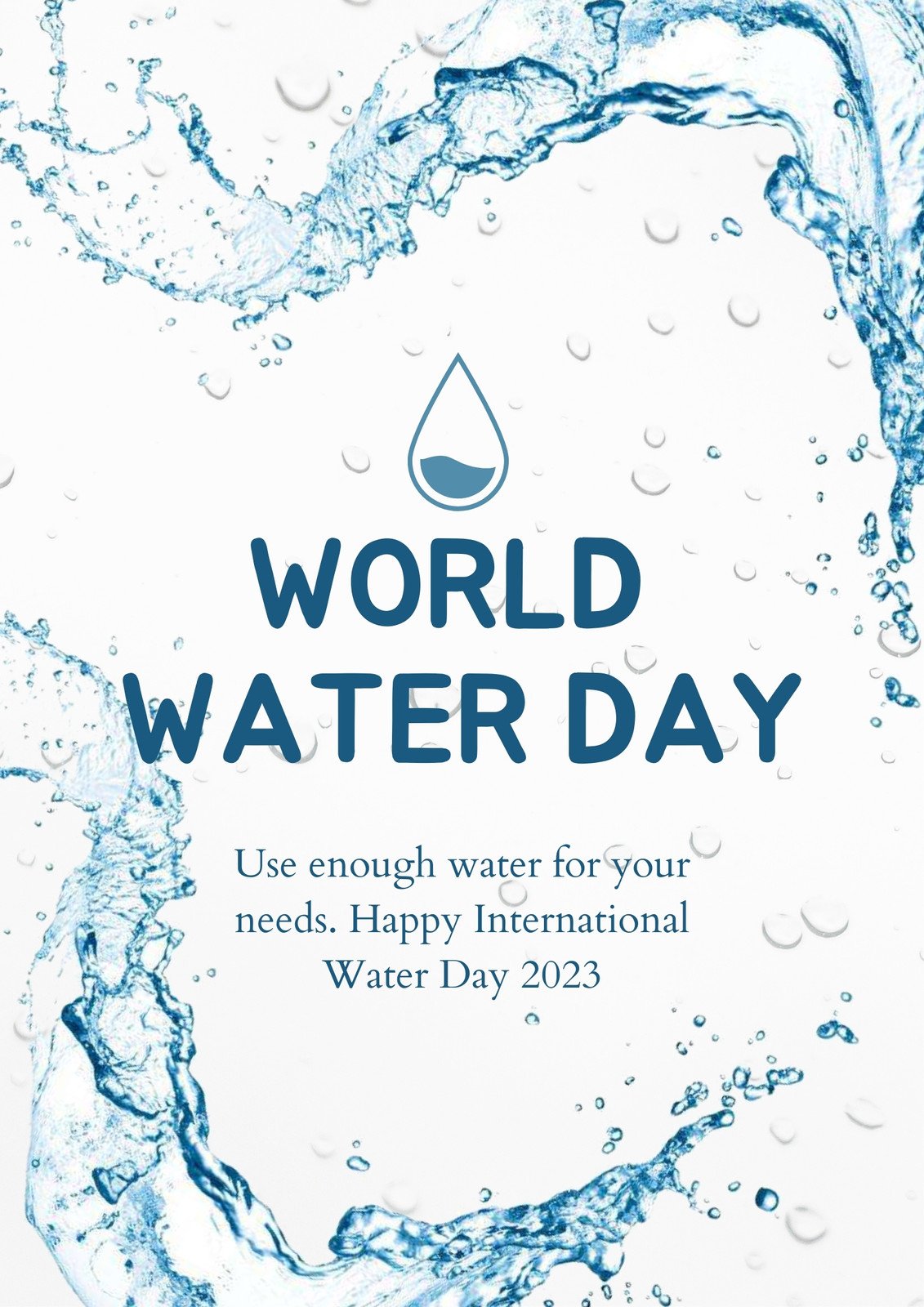
Refresh Your Walls: Cool Water Poster Design Ideas in English
When you think of “cool water” you probably picture rippling waves, sparkling droplets, or the tranquil blue of a mountain lake. Translating that vibe into a wall poster can turn any space—from a coffee shop lobby to a home office—into a refreshing visual retreat. Below you’ll find a blend of classic motifs and off‑beat twists, all described in plain English, that will spark your own creative process.
Cool Water Poster Ideas: English Design Themes
Choosing a theme is the first step. Here are a few reliable directions that consistently work, plus a couple of unexpected routes you might not have considered.
- Minimalist Tide – Simple line art of a single wave or a water droplet, paired with a clean sans‑serif font.
- Vintage Ocean Maps – Retro cartographic elements, muted sepia tones, and nautical terminology like “Latitude” or “Current.”
- Abstract Fluidity – Swirling ink‑blots or digital paint strokes that suggest motion without depicting a specific scene.
- Eco‑Message Posters – Combine water imagery with short, punchy slogans about conservation, written in a bold, readable typeface.
- Typographic Waves – Arrange words that describe water (“flow,” “cool,” “clear”) into the shape of a wave, letting the text become the image.
Typography Tricks for a Splashy Look
Words are as much a visual element as any illustration. To keep the design feeling “cool,” opt for typefaces that echo water’s qualities. A thin, slightly condensed sans‑serif conveys sleekness, while a hand‑drawn script can mimic the fluidity of a river’s curve. Pair a bold headline with a lighter body copy; the contrast adds depth without overcrowding the layout.
Don’t forget kerning. Slightly wider spacing between letters can evoke the airy openness of a clear sky above a lake. When you want to emphasize a single word—perhaps “REFRESH”—scale it up dramatically and let it dominate a corner of the poster, then let the surrounding elements flow around it.
Color Palettes That Evoke Fluidity
Blue is the obvious choice, but there’s a whole spectrum worth exploring:
- Ice‑Blue & Soft Gray – Perfect for a calm, clinical feel, ideal for office spaces.
- Turquoise & Coral – Adds a tropical punch, great for cafés or creative studios.
- Deep Navy & Gold Accents – Conveys depth and luxury, suitable for boutique hotels.
- Monochrome Blues – Layer several shades of the same hue to create subtle gradients that mimic water’s natural shading.
When you’re in doubt, start with a base of 60 % blue, sprinkle in 20 % neutral (white or gray), and finish with 20 % accent color for contrast.
Mixing Media and Textures
Purely digital posters look sleek, but adding a tactile element can make the piece feel more alive. Consider these hybrid approaches:
- Watercolor Washes – Scan a hand‑painted wash and blend it with vector graphics for an organic‑digital hybrid.
- Photographic Overlays – Use a high‑resolution macro shot of water droplets as a subtle background texture.
- Embossed Ink – For print‑only versions, request spot‑UV or embossing on wave shapes; the raised surface catches the light like real water.
The key is balance; the texture should support, not distract from, the central message.
Where to Find Printable Templates
If you’re short on time, a handful of reputable sites offer ready‑made, editable templates. Look for platforms that allow you to swap out the text while keeping the design elements intact. Popular options include:
- Creative Market – Offers both free and premium poster files in PSD and AI formats.
- Canva – User‑friendly drag‑and‑drop interface; search for “water poster” and filter by “English” text.
- Etsy – Independent designers often sell printable PDFs that you can customize with your own slogan.
Always check the license; many creators permit personal use but require a commercial license for business applications.
DIY Steps for Your Own Poster
Ready to roll up your sleeves? Follow this straightforward workflow, which works whether you’re using Adobe Illustrator, Affinity Designer, or a free vector editor.
- Sketch Your Concept – Spend 10‑15 minutes doodling rough ideas on paper. Focus on layout: where will the image sit, and where will the text go?
- Choose a Canvas Size – Common poster dimensions are 18×24 inches or A2 (16.5×23.4 in). Set your document’s resolution to 300 dpi for crisp print quality.
- Build the Background – Apply a gradient or texture that reflects your chosen color palette. Keep it subtle; you want the foreground elements to pop.
- Add Primary Imagery – Import a vector wave, a stock photo of water, or hand‑draw a shape. Position it according to the rule of thirds for visual balance.
- Insert Text – Type your headline, adjust tracking, and experiment with hierarchy. Remember the tip about wider kerning for a breezy feel.
- Fine‑Tune Details – Add shadows, highlights, or a slight bevel to give depth. Make sure there’s enough contrast for readability from a distance.
- Export for Print – Save as a PDF with bleed settings (usually 0.125 in). If you’re printing yourself, use a high‑quality matte or semi‑gloss paper to enhance the water effect.
The whole process can be completed in under an hour once you’re familiar with the tools, and the result is a unique piece that feels both professional and personal.
FAQ
What font styles work best for a water‑themed poster?
Light sans‑serif fonts convey sleekness, while a hand‑written script can suggest fluid movement. Pair a bold headline with a lighter body copy for contrast, and play with kerning to add a breezy feel.
Can I use a cool water poster in a corporate setting?
Absolutely. Choose a subdued palette—ice‑blue with gray—and keep the imagery minimal. Adding a subtle tagline about clarity or efficiency can tie the design to corporate branding.
Do I need a special printer for the embossed water effect?
Embossing or spot‑UV finishes require a professional print shop that offers those services. For home printing, a high‑gloss paper can mimic the shine of water without extra equipment.
Where can I find royalty‑free water images?
Sites like Unsplash, Pexels, and Pixabay host high‑resolution photos under Creative Commons licenses. Always double‑check the specific usage terms before incorporating them into a commercial poster.