How to Build a Financial Report Dashboard in Excel
Why a Dashboard Beats a Static Spreadsheet
Numbers on their own are easy to ignore. A well‑designed dashboard, however, turns raw data into a visual story that executives can scan in seconds. In Excel, you can achieve that clarity without buying pricey BI tools—just a few formulas, some clever formatting, and a pinch of imagination.
Step 1: Gather and Clean Your Source Data
Everything starts with reliable data. Pull your profit‑and‑loss, balance sheet, and cash‑flow statements into a single workbook, each on its own sheet. Use Table objects (Ctrl + T) so the ranges expand automatically when new rows appear. A quick trim and remove duplicates run will spare you headaches later.
- Standardise date columns to the same format (e.g., YYYY‑MM).
- Convert any text‑based numbers to true numeric values with
=VALUE(). - Flag missing entries with
=IFERROR()so they don’t break your charts.
Step 2: Create the Core Metrics
Dashboards live on key performance indicators, not on every line item. Decide on the handful of figures that matter most—gross margin, operating expense ratio, net cash flow, etc. Then set up a “Metrics” sheet that pulls those numbers from the raw tables.
Typical formulas include:
- Gross Margin:
=Revenue-COGSthen divide by Revenue. - Expense Ratio:
=OperatingExpenses/Revenue. - YoY Growth:
= (CurrentPeriod-PreviousPeriod)/PreviousPeriod.
Use named ranges for each metric; it makes later references cleaner and reduces errors when you drag charts around.
Step 3: Design the Layout
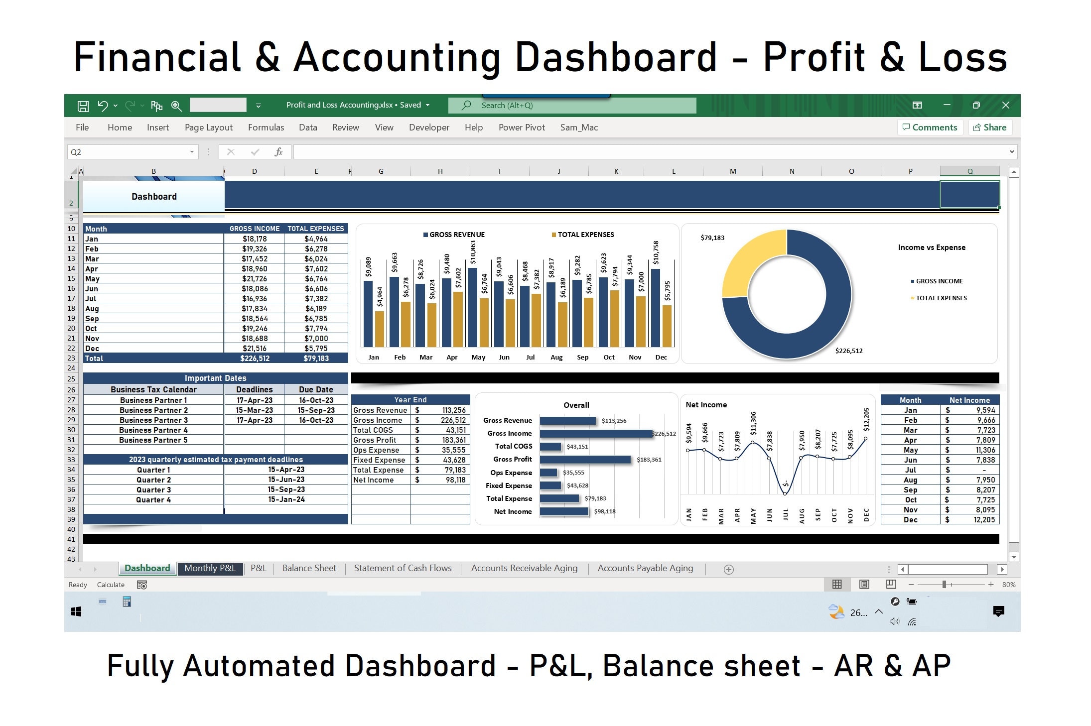
Think of the dashboard as a newspaper front page—most important info at the top, supporting details below. Sketch a rough wireframe on paper first; then replicate it in Excel using a dedicated “Dashboard” sheet.
Reserve the first two rows for a title and a date picker. A Data Validation dropdown linked to a cell (say, B1) can let users choose the reporting period, while formulas like =INDEX(Metrics!$A$2:$A$100, MATCH($B$1, Metrics!$B$2:$B$100,0)) feed the selected period’s numbers into the visual tiles.
Step 4: Insert the Visual Tiles
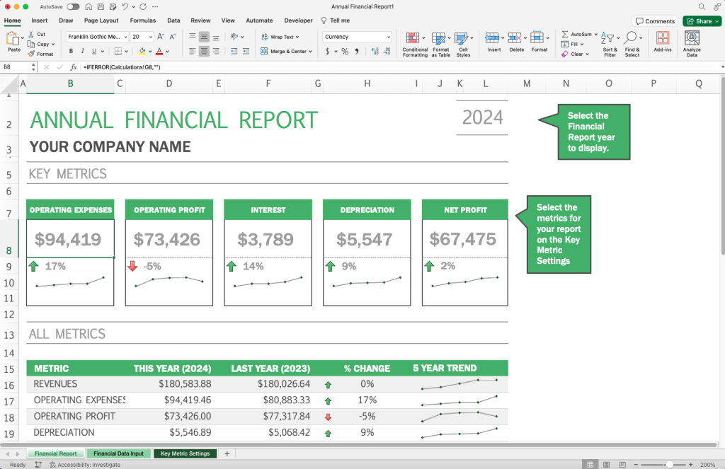
For each KPI, use a combination of Conditional Formatting and Sparklines. A typical tile might include:
- A large, bold number (e.g.,
=TEXT(CurrentMargin,"0.0%")). - A small arrow icon that turns green for improvement, red for decline—handled by a custom rule on the cell’s value.
- A three‑month sparkline that gives a quick trend line.
Keep spacing even; the human eye likes symmetry. If you’re comfortable with it, add a data bar that fills the cell proportionally to the metric’s target.
Step 5: Build the Supporting Charts
Beyond tiles, a dashboard often needs a couple of charts that dive deeper. A clustered column chart is perfect for showing revenue versus budget across months. A stacked area chart can illustrate cash‑flow sources and uses.
When you insert a chart, link its source to the dynamic range on the “Metrics” sheet. Use the OFFSET function together with the period selector so the chart updates automatically when the user flips the dropdown.
Step 6: Add Interactivity with Slicers
If your data includes multiple dimensions—regions, product lines, or business units—turn your tables into PivotTables and attach Slicers. A slicer is essentially a button that filters all linked charts and tiles at once, giving viewers the ability to drill down without writing a single macro.
Remember to set the slicer style to “No Caption” for a cleaner look, and align it flush against the edge of the dashboard.
Step 7: Polish the Presentation
Now that the mechanics work, focus on visual hygiene. Choose a muted colour palette (e.g., navy, teal, and soft gray) and reserve bright hues—like orange or green—only for alerts. Consistent fonts (Calibri 11 works well) keep the sheet from looking like a collage of random styles.
Hide gridlines and headings on the dashboard sheet: View > Show > uncheck Gridlines and Headings. Freeze the top row so the title stays visible when scrolling. Finally, protect the sheet (Review > Protect Sheet) but leave the period selector unlocked so users can still interact.
Step 8: Share and Refresh
Save the workbook as an .xlsx for everyday use, but also consider an .xlsm if you embed a small macro to refresh all data connections on open. When you need to send the dashboard to stakeholders, export just the “Dashboard” sheet as a PDF—no one wants to sift through raw tables.
For ongoing accuracy, schedule a nightly Power Query refresh if your source files live on a shared drive or a cloud service. That way, the next morning the numbers are already up to date, and the dashboard is ready to click.
Common Pitfalls and How to Avoid Them
- Over‑crowding: More charts don’t equal more insight. Stick to three to five visuals maximum.
- Hard‑coded references: Avoid formulas like
=B2that break when rows are inserted. Use named ranges or structured references instead. - Slow performance: Too many volatile functions (e.g.,
OFFSET,INDIRECT) can bog down the workbook. Replace them with simpleINDEXlookups wherever possible. - Missing documentation: Add a hidden “Read Me” sheet that explains each KPI, data source, and refresh schedule. Future users will thank you.
Putting It All Together
When you step back, a finished financial dashboard should feel like a cockpit: the pilot glances at a few gauges, knows instantly whether the aircraft is climbing or descending, and can adjust the controls without rummaging through manuals. In Excel, that cockpit is built from tables, formulas, and a dash of design sense. Follow the steps above, iterate based on feedback, and you’ll have a live financial report that tells the right story at the right time.