How to Choose and Use Master’s Touch Watercolors Effectively
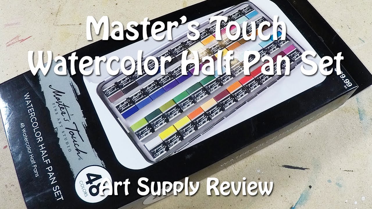
When it comes to portable art supplies, the Master’s Touch watercolor set often lands on the top of many hobbyists’ wish lists. Its compact packaging, vibrant pigments, and affordable price make it a tempting option for both beginners and seasoned painters. But does it really live up to the hype? Below, I walk through the essentials—what’s in the box, how the paints behave, and a few practical tips to get the most out of them.
What You Get in the Box
The set is surprisingly sleek. Inside the tin you’ll find:
- 24 half‑pan tubes of water‑based pigment, each labeled with a color name and a subtle reference number.
- A small mixing palette that folds out for quick color blending.
- A pair of synthetic brushes—one fine tip for detail work and one broader flat for washes.
- A compact zip‑lock pouch for storing your mixed colors on the go.
The pans are thin enough to snap open with a fingernail, yet sturdy enough to survive a few drops in a backpack. The pigments themselves feel slightly granular, a trait that can be a plus when you like the texture of granulating watercolor.
Performance Overview
Color Intensity and Transparency
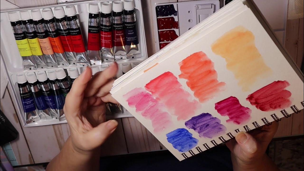
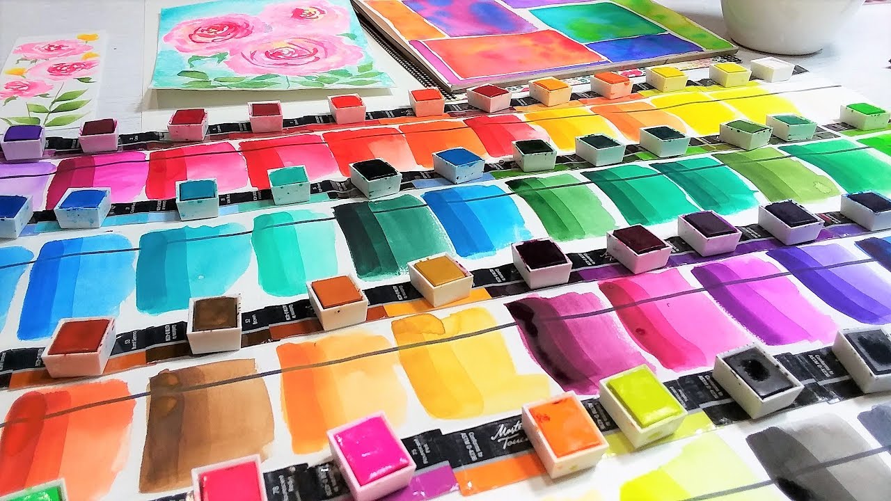
Most of the hues sit comfortably in the semi‑transparent range, which means they layer nicely without turning muddy. A few of the deeper blues and emerald greens lean toward semi‑opaque, giving you a bit of flexibility if you prefer a more solid finish on certain areas.
Blendability
Because the pans are water‑soluble, they rehydrate quickly. A few drops of clean water on the palette and the pigments dissolve within seconds, allowing you to transition from a light wash to a saturated tone in one fluid motion. The key is to work on a slightly damp paper—too dry and the colors can appear grainy; too wet and they may spread beyond the intended edges.
Lightfastness
On the manufacturer's sheet, most colors are rated “moderate” for lightfastness. In practical terms, a finished piece displayed in indirect light should hold its vibrancy for years. If you plan to sell or frame works for long‑term display, you might want to protect them with UV‑resist glass.
Tips for Getting the Best Results
- Pre‑wet the paper: Lightly spritzing the surface before applying pigment helps achieve smoother gradients.
- Mix in small batches: Since the pans dry out fast, only mix what you need for the immediate session.
- Test on scrap paper: Before committing a color to your artwork, try a swatch; the pigments can shift slightly when they dry.
- Layer strategically: Start with light washes, then add deeper tones once the first layer is dry to avoid unintended blending.
Who Will Benefit Most?
Traveling artists will appreciate the tin’s ruggedness and the compact brush set. Art teachers looking for an economical classroom supply also find the range of hues adequate for teaching basic color theory. Meanwhile, more advanced watercolorists might use Master’s Touch as a supplemental palette for quick studies or sketching sessions, reserving their professional tubes for final pieces.
Potential Drawbacks
If you’re after the absolute highest archival quality, the moderate lightfastness rating could be a limitation. Additionally, the synthetic brushes, while convenient, won’t match the springiness of natural sable for extremely fine detail work. That said, they are replaceable and inexpensive, so the overall cost remains friendly.
Final Thoughts
Master’s Touch watercolors strike a solid balance between affordability and performance. They’re portable enough to fit in a messenger bag, vibrant enough to inspire, and versatile enough for a range of skill levels. Treat them as a reliable workhorse—use them for plein air sketches, quick studies, or even finished pieces when you pair them with proper paper and a light‑fast finish. In short, they’re worth a try, especially if you’re looking to expand your palette without breaking the bank.