How to Create Eye‑Catching Instagram Story Highlight Covers
Instagram Stories are fleeting, but the highlights you pin to your profile stick around for good. The little square that represents each highlight—its cover—can turn a bland grid into a visual résumé of your brand or personality. Below is a practical walk‑through, from choosing a style to uploading the final image, that helps you design covers that attract eyes and convey meaning without feeling forced.
Why Cover Design Matters
Think of a highlight cover as the cover of a book. It doesn’t tell the whole story, but it sets expectations. A cohesive set of covers can:
- Reinforce brand colors and typography.
- Make it easier for visitors to find the content they care about.
- Boost the overall aesthetic of your profile, encouraging follows.
That subtle boost in visual appeal often translates into a higher engagement rate, simply because people feel the account is curated with care.
Getting Started: Gather Your Assets
Before you dive into design software, pull together the basics you’ll need.
1. Define a Theme
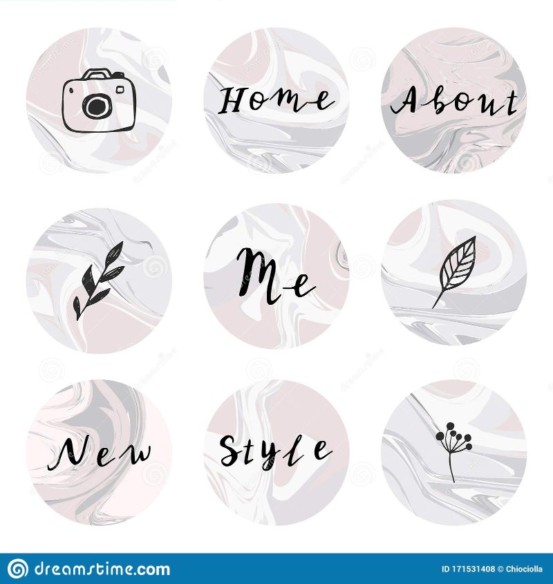
Do you want a minimalist monochrome vibe, a pastel palette, or bold, colorful icons? Pick one direction and stick to it for all covers, otherwise the grid can look disjointed.
2. Choose Your Tools
There are plenty of free and paid options. A few popular choices:
- Canva: Drag‑and‑drop templates, easy for beginners.
- Adobe Spark: More control over layers and typography.
- Procreate (iPad): Ideal if you draw your own icons.
Most tools let you export a 1080 × 1080 px PNG, which is exactly what Instagram expects for highlight covers.
Design Tips That Actually Work
Here are the little tricks that separate a “good enough” cover from one that feels intentional.
Use Simple Icons
Complex images get lost when Instagram shrinks them to a tiny circle. A solid silhouette or a bold line‑art icon stays recognizable. If you’re representing “Travel,” a simple airplane or suitcase works better than a full‑blown landscape photo.
Play With Contrast
High contrast ensures legibility. Pair a dark icon with a bright background, or vice versa. If your overall page uses muted tones, a splash of bright color in the covers can act as a visual hook.
Maintain Consistent Padding
Visible space around the icon prevents it from touching the edge of the circle. Aim for roughly 10‑15% padding on all sides. Most design tools have guides or a grid you can snap to, which makes this easier.
Incorporate Your Brand Font (Sparingly)
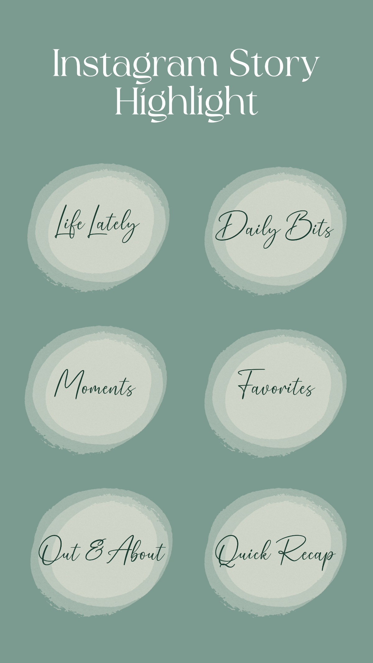
If you love typography, consider adding a single letter or short word—like “B” for “Books.” Keep it tiny; the focus should remain on the icon.
Step‑by‑Step Creation Process
- Open a square canvas (1080 × 1080 px). Set the background color to match your chosen theme.
- Import or draw your icon. Position it in the center, leaving the recommended padding.
- Adjust colors for contrast. Test how it looks against both light and dark mode (Instagram users can switch).
- Export as PNG. Keep the file size under 500 KB to avoid upload hiccups.
- Upload to Instagram. Go to your profile → press and hold a highlight → “Edit Highlight” → “Edit Cover” → “Add From Camera Roll” and select your new PNG.
A quick tip: after uploading, view the highlight on another device. If the icon looks fuzzy or the colors shift, go back and tweak the file—sometimes a slight change in brightness makes a big difference.
Organizing Highlights for Maximum Impact
Design is only half the story. How you group your highlights influences navigation.
- Group by theme: Travel, Food, Workouts, FAQs.
- Order by relevance: Put the most important or recent topics first.
- Use descriptive titles: Keep them under 12 characters so they don’t truncate.
When titles are short and covers are clear, visitors can skim through your highlights in a couple of seconds, deciding instantly what to explore.
Common Mistakes to Avoid
Even seasoned creators slip up now and then. Spot these pitfalls early.
- Over‑loading the icon: Too many details get lost in the tiny circle.
- Inconsistent style: Mixing flat icons with 3‑D renders looks chaotic.
- Ignoring dark mode: A bright cover that blends into a dark background defeats the purpose.
- Using low‑resolution images: Pixelation is instantly noticeable.
Taking a moment to preview each cover under both light and dark settings can save you from these errors.
Keeping Your Highlights Fresh
Don’t set it and forget it. Periodically (once a month or after a major campaign) revisit your covers. Updating a color palette or swapping an icon to reflect a new season keeps the profile feeling alive.
Final Thoughts
Creating Instagram Story highlight covers is a blend of design intuition and practical steps. By establishing a clear theme, using simple high‑contrast icons, and staying consistent across the board, you turn a simple set of squares into a polished showcase of what you offer. With these guidelines, you’re ready to give your profile that extra polish that makes casual browsers pause and explore.