How to Design Peace Posters That Spark Unity and Harmony
When you walk past a street corner and spot a poster bursting with bright colors and hopeful words, you feel a subtle shift—a reminder that we’re all sharing the same space. That gentle nudge is exactly what a well‑crafted peace campaign poster can do. Below, we explore the visual and emotional ingredients that turn a simple flyer into a rallying call for togetherness.
Understanding the Core Message
Before you even pick a font, ask yourself what the poster needs to convey. Unity and harmony aren’t abstract concepts; they’re lived experiences that vary from community to community.
- Local relevance: Reference a shared landmark, a neighborhood event, or a cultural symbol.
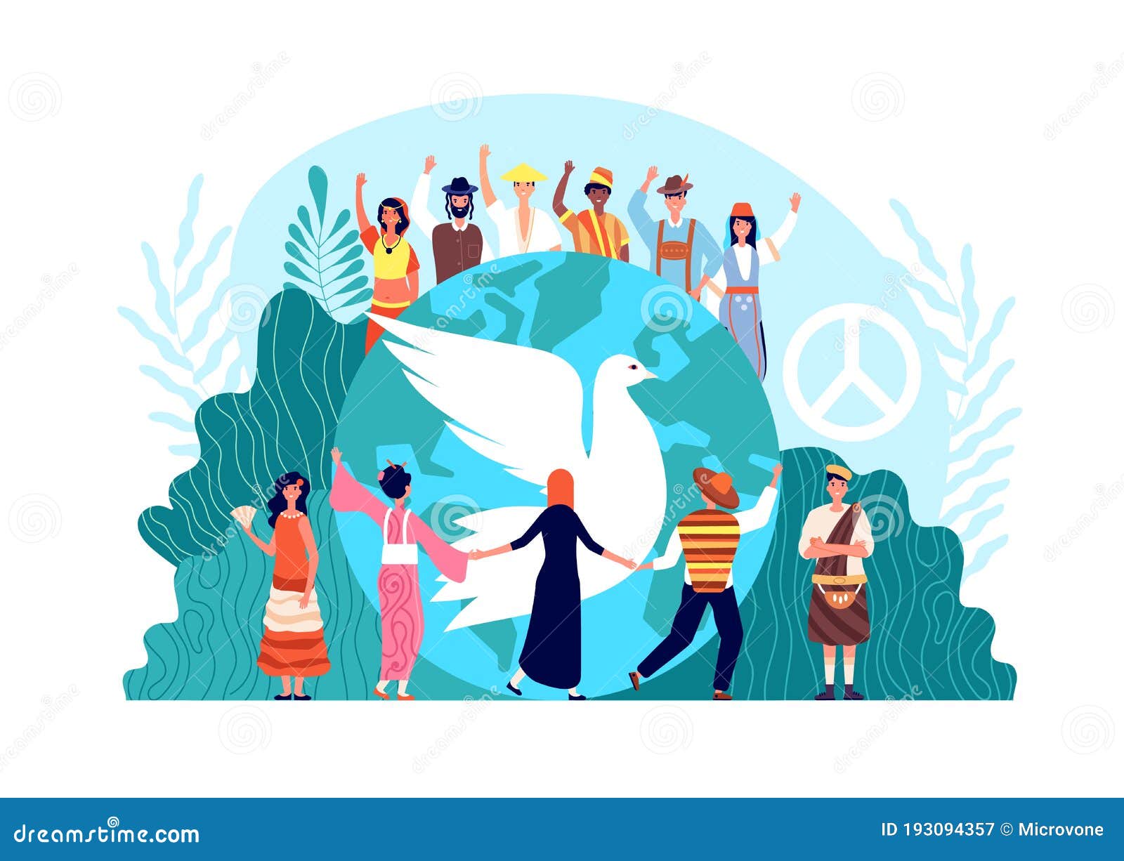
- Universal language: Use symbols like doves, joined hands, or interlocking circles that resonate beyond borders.
- Actionable call: Instead of vague “peace,” suggest a concrete step—“Join the park clean‑up” or “Share a story of kindness.”
Choosing Colors That Calm and Motivate
Color psychology isn’t a strict rulebook, but certain hues consistently evoke feelings of tranquility.
Soft blues and greens
These shades mimic sky and foliage, instantly grounding the viewer. A pale teal background can make bold text pop without feeling aggressive.
Warm accents
Touches of sunrise orange or gentle gold add optimism. Use them sparingly—perhaps for a headline or a key icon—to draw the eye.
Contrast for readability
A high‑contrast ratio (dark text on a light background) ensures the message is legible from a distance. Test your design by stepping back; if you can read it from a few meters, you’re on the right track.
Typography: Speaking With Text
Words are powerful, but how you present them can amplify or mute their impact.
- Headlines: Opt for a bold, sans‑serif typeface that commands attention without shouting.
- Supporting copy: A clean serif or rounded font adds warmth and readability.
- Hierarchy: Keep the headline larger, the body text modest, and any tagline in a slightly different style to guide the eye.
Remember, too many fonts create visual clutter. Two complementary families usually suffice.
Incorporating Symbolic Imagery
Images should feel inclusive, not exclusive. Choose illustrations that invite participation rather than imposing a single viewpoint.
- Silhouettes of diverse hands reaching toward a common center.
- Simple line drawings of community landmarks rendered in a stylized, welcoming way.
- Abstract patterns that suggest interconnection—think woven threads or overlapping circles.
When possible, enlist local artists. Their authentic style can turn a poster into a piece of community heritage.
Layout Tricks That Guide the Viewer
A chaotic arrangement can drown the message. Here are three layout principles to keep in mind.
- Rule of thirds: Divide the poster into a three‑by‑three grid; place the main visual element on one of the intersecting points for natural balance.
- White space breathing room: Gaps aren’t wasted; they let each element breathe and make the overall design feel calm.
- Visual flow: Use arrows, lines, or the direction of a figure’s gaze to lead the eye from the headline through the call‑to‑action.
Printing and Placement Considerations
Even the most stunning design can falter if the medium isn’t right. Think about the environment where the poster will live.
- Material: Weather‑resistant vinyl for outdoor walls; matte paper for community centers.
- Size: Large formats (24×36 inches) work well on bus stops; smaller (11×17 inches) fit bulletin boards.
- Height: Position eye‑level for adults, but consider a lower strip for children’s eye lines in schools.
Measuring Impact Without Over‑Analyzing
After the posters go up, a quick gauge can tell you if you’re hitting the mark.
- Observe foot traffic near the display—more lingerers often mean curiosity sparked.
- Collect informal feedback: a quick chat or a QR code leading to a short poll.
- Notice any uptick in participation for the highlighted event or activity.
These modest checks keep the focus on genuine community response rather than vanity metrics.
Iterate, Don’t Perfect
Design is a conversation, not a monologue. The first version may resonate, but a second or third iteration, informed by real‑world reactions, can deepen the sense of unity.
In practice, that could mean swapping a color that feels too “cold” for a warmer hue, or adding a locally recognized symbol that wasn’t considered initially. Flexibility shows respect for the audience’s voice.
Ultimately, a peace campaign poster is more than paper and ink; it’s a bridge. By blending thoughtful messaging, considerate visuals, and community involvement, you create a visual invitation that encourages people to stand together, even if just for a moment, before stepping back into their daily lives.