How to Read Real‑Time Data on Yahoo Finance Charts
When you pull up a stock on Yahoo Finance, the chart that flashes across the screen isn’t just a pretty picture—it’s a constantly updating feed of market activity. Understanding what those lines mean and how the platform refreshes them can give you a edge, whether you’re a day trader or just keeping an eye on a long‑term investment.
What “Real‑Time” Actually Means
In the world of finance, “real‑time” usually implies a delay of a few seconds at most. Yahoo Finance sources its live quotes from exchanges that allow delayed public feeds, so you might see a tiny lag compared to the official exchange ticker. For most retail investors, that tiny gap is negligible, but it’s worth noting if you’re chasing micro‑second moves.
Choosing the Right Timeframe
The chart toolbar lets you toggle between intervals like 1 minute, 5 minutes, daily, or even monthly. Shorter intervals show the market’s heartbeat, while longer ones smooth out the noise.
- 1‑minute or 5‑minute bars: Ideal for scalpers watching intraday volatility.
- 15‑minute to hourly bars: Good for swing traders seeking medium‑term trends.
- Daily and beyond: Best for investors focusing on fundamental shifts.
Switching between these views is as simple as clicking the dropdown—no need to refresh the page.
Reading the Candles
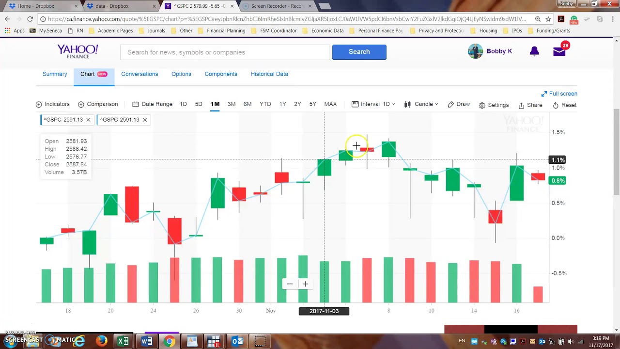
Most users recognize the classic “candlestick” shape: a thick body flanked by wicks. Here’s a quick cheat sheet:
- Green (or white) candle: Close higher than open—price rose during that period.
- Red (or black) candle: Close lower than open—price fell.
- Long wick: Indicates the price moved far beyond the open/close but snapped back.
Spotting a series of long wicks can hint at market indecision; a string of solid green candles often signals momentum.
Technical Indicators at Your Fingertips
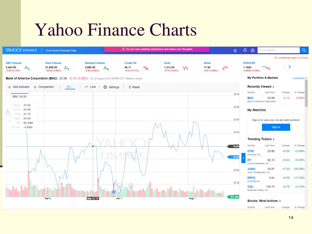
Yahoo Finance doesn’t just show raw price movement. By clicking the “Indicators” button you can overlay tools like Moving Averages, Bollinger Bands, or RSI. These aren’t magic—think of them as lenses that highlight patterns you might otherwise miss.
For example, a 20‑day moving average crossing above the price could be a bullish signal, while the same crossing below might suggest weakening strength. It’s easy to add or remove these overlays, so experiment until you find a combo that feels intuitive.
Understanding Refresh Rates
Most charts update every 15 seconds for free users. If you have a premium subscription, the refresh can be as fast as one second. The discrepancy matters if you’re monitoring high‑frequency stocks that swing wildly in a minute.
Keep an eye on the small “last updated” timestamp tucked in the corner of the chart—if it lags beyond the expected interval, a temporary glitch might be causing the slowdown.
Switching Between Delayed and Live Data
If you’re worried about the occasional lag, you can toggle to “Live” mode under the Settings gear. This pulls data directly from sources that permit sub‑second updates, though it sometimes flags a disclaimer about data quality.
Remember, “live” on Yahoo Finance still isn’t the same as the proprietary feeds used by professional brokerages. But for most retail strategies, the difference is marginal.
Setting Up Alerts Without Leaving the Chart
Need a heads‑up when a stock hits a particular price? Right‑click on the chart line and select “Create Alert.” You can define thresholds for price, percentage change, or even crossing a moving average.
Alerts trigger via email or push notification, depending on your account settings. It’s a handy way to stay informed without staring at the screen all day.
Limitations to Keep in Mind
Even the best free tool has boundaries. Here are a few you’ll likely run into:
- Limited historical depth for some international tickers.
- No direct order placement from the chart— you still need a broker.
- Occasional “data freeze” during high‑volume trading spikes.
These aren’t deal‑breakers; they’re just reminders that no single platform can replace a full‑featured trading workstation.
Tips for Getting the Most Out of Yahoo Finance Charts
To make the most of the real‑time visuals, try these practical habits:
- Bookmark your favorite layouts. Save a specific timeframe and indicator set so you can jump back in without re‑configuring.
- Use the “Compare” feature. Overlay another ticker to see relative performance instantly.
- Check the “Summary” tab. Quick glance at key stats, earnings dates, and analyst sentiment.
These tweaks can shave seconds off your analysis—an often‑overlooked advantage in fast‑moving markets.
When to Let the Chart Rest
It’s tempting to stare at a live chart all day, but over‑monitoring can breed anxiety. If you’re a long‑term investor, set a weekly check‑in instead of a minute‑by‑minute watch. The data will still be there when you return, and you’ll avoid the “analysis paralysis” trap.