How to Use Axios' News Bias Chart to Gauge Media Accuracy
Ever found yourself staring at a headline and wondering whether it’s tinted by politics or simply factual? Axios has tried to tip the scales with its News Bias Chart, a visual guide that rates outlets on both ideological leanings and factual reliability. If you’re curious about what the chart really tells you—and how to make it work for your daily reading—keep scrolling.
What Is the Axios News Bias Chart?
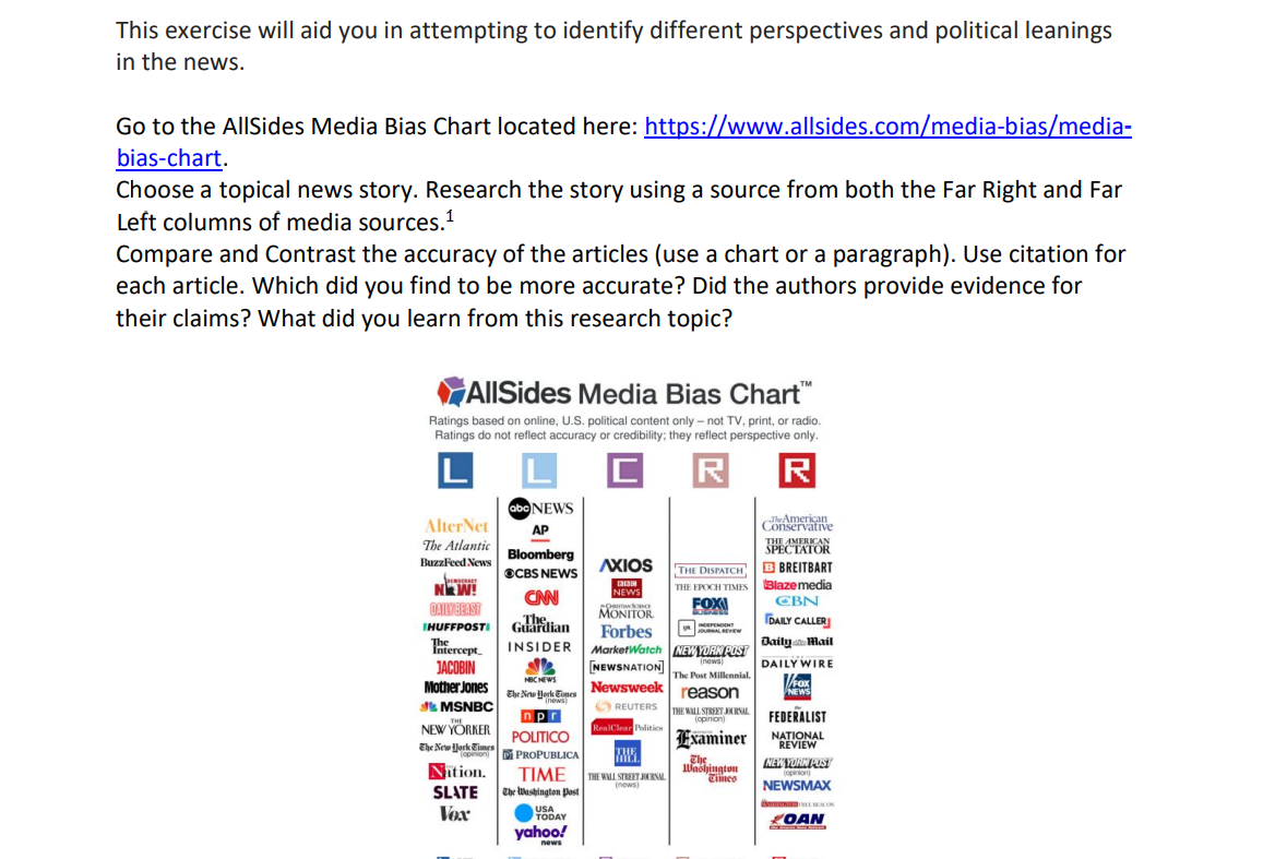
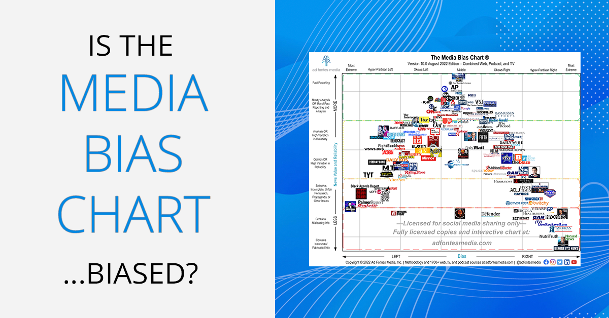
At its core, the chart is a two‑dimensional grid. One axis runs from “Left” to “Right,” mapping out the political spectrum of major news sources. The other axis measures “Accuracy,” ranging from “Low” to “High.” Each outlet lands somewhere on this plane, marked by a colored square that conveys its approximate positioning.
Axios built the chart using a blend of public data—like audience surveys and fact‑checking scores—from reputable third‑party organizations. The goal isn’t to rank media like a competition; it’s to give readers a quick visual cue about where a source sits in the broader media landscape.
How the Chart Measures Accuracy
Accuracy isn’t a binary “true or false” label. Instead, the chart aggregates several indicators:
- Fact‑checking success rates: How often a source’s stories pass verification by groups such as PolitiFact or FactCheck.org.
- Corrections frequency: Whether the outlet promptly issues corrections when errors surface.
- Source transparency: The openness about where information originates, especially for breaking news.
Each factor gets a score that contributes to an overall accuracy rating. The final placement on the chart reflects a weighted average, so a source can be “center‑right” yet still land high on the accuracy axis if it consistently backs up its claims.
Scoring System in Practice
Consider two hypothetical outlets:
- Outlet A scores 85% on fact‑checking, issues corrections swiftly, and cites primary sources. It lands near the top of the accuracy column, regardless of its left‑leaning stance.
- Outlet B has a strong right‑wing perspective but only 55% fact‑checking success, with occasional vague sourcing. It sits lower on the accuracy axis, even though its political label is clear.
These examples illustrate why the chart can be more nuanced than a simple “left = biased, right = reliable” narrative.
Interpreting the Chart: Tips for Readers
When you glance at the chart, don’t just note the color. A few mental checkpoints can sharpen your reading:
- Cross‑reference: If an article feels one‑sided, check other outlets positioned differently on the political axis but similar on accuracy.
- Watch the extremes: Sources that sit at the far ends of both axes often have strong editorial slants; treat them as perspectives rather than definitive facts.
- Note the middle ground: Centers with high accuracy scores typically offer balanced reporting—good starting points for a quick news digest.
- Consider context: Some topics, like foreign policy, may see even high‑accuracy outlets lean left or right due to prevailing expert consensus.
Limitations and Things to Keep in Mind
No chart is perfect. Axios’ model, while robust, still faces challenges:
- Static snapshots: Media bias can shift over time; the chart updates periodically, but a sudden editorial change might lag behind.
- Subjectivity in scoring: Fact‑checking organizations occasionally disagree, especially on nuanced political claims.
- Scope: The chart focuses on major U.S. outlets; niche blogs or international sites fall outside its grid.
Take these caveats as reminders to treat the chart as a guide, not a gospel.
Putting It to Work: Practical Steps
Ready to let the chart inform your news diet? Here’s a quick workflow you can adopt:
- Identify your primary sources. List the outlets you read daily.
- Locate them on the chart. Use Axios’ interactive version to see where each sits.
- Balance the spectrum. If most of your sources are clustered on one side, add a couple from the opposite side that also rank high on accuracy.
- Spot check headlines. When a story catches your eye, glance at its source’s chart position before diving in.
- Cross‑verify. For high‑stakes topics—elections, health policy—consult at least two outlets with differing political positions but comparable accuracy scores.
By weaving these steps into your routine, you’ll likely notice a more rounded view of current events without feeling overwhelmed.
Why It Matters
In an era where misinformation spreads faster than ever, tools like Axios’ News Bias Chart act as a compass. They don’t eliminate bias—a reality no outlet can fully escape—but they do illuminate the terrain, helping readers navigate toward more reliable information. The next time you open your news feed, pause for a second, glance at the chart, and let that visual cue shape the stories you choose to trust.